| Inspiration
Press pause on pastels: The warm spring colour palette for 2026
Spring interiors are often defined by soft pastels – powder blues, pale pinks and mint greens that bring a light and airy feel to the home.


Spring interiors are often defined by soft pastels – powder blues, pale pinks and mint greens that bring a light and airy feel to the home. But as we step into 2026, interior trends are shifting in a warmer, richer direction.
If you're looking to refresh your home for the season ahead, here's how the warm spring colour palette is redefining interiors – and how you can incorporate it into your own space.
Interior trends tend to reflect how we want our homes to feel. There's now a growing shift towards comfort, warmth and connection to nature. Seasonal colour palettes are evolving to reflect these priorities.
Rather than the delicate coolness of traditional pastels, many designers are now embracing warmer tones that feel cosy yet uplifting. These colours still capture the freshness of spring, but with a little more depth.
Several influences are driving this change:
· A continued love for natural interiors – Earthy colours inspired by landscapes and greenery are becoming increasingly popular. These tones create spaces that feel relaxed and restorative.
· The move towards layered interiors – Homes are moving away from minimal, stark designs and towards spaces that feel more lived-in and personal. Warmer colours help add character and visual interest.
· A desire for longevity in design – Many homeowners are choosing colours that work beyond one season. Richer spring shades transition beautifully into summer and autumn, making them a more versatile choice.
If you're ready to move beyond traditional pastels, there are plenty of beautiful ways to introduce warmer tones into your home this spring. Here are some of the standout colours we're seeing this year:
Green continues to dominate interior trends, but the focus has shifted towards earthier shades such as olive, moss and forest green.
These tones feel calming and timeless and bring a strong connection to nature. They work particularly well alongside natural materials like wood and stone.
A softer alternative to bright sunshine yellow, buttery tones bring warmth and light to a room without feeling overwhelming.
This shade pairs beautifully with warm neutrals and works especially well in living spaces and dining areas.
Inspired by sun-baked earth, terracotta adds instant warmth and character to interiors.
It works well as an accent colour in cushions, artwork and decorative accessories, but can also make a statement on feature walls or upholstery.
Beige, sand and oat tones are replacing cooler greys in many homes.
These warmer neutrals create a soft backdrop that allows richer colours to shine while letting spaces feel calm and balanced.
Introducing a new colour palette doesn't mean redecorating an entire room. The most effective interiors are built through layering colour thoughtfully.
Here are a few simple ideas to help you bring the warm spring palette into your home.
Cushions, throws and rugs are some of the easiest ways to experiment with new colours. Try layering olive greens and terracotta accents to add depth and texture to your living room.
These smaller updates can instantly refresh a space for spring without a huge overhaul.
Warm spring colours look particularly chic alongside natural materials such as wood, rattan, linen and ceramics.
These textures create a relaxed, organic feel that complements earthy tones perfectly.
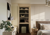
Our green fitted furniture is a perfect example of how colour can transform a room while maintaining a calm, elegant look.
Designed to maximise your space, our fitted living room storage creates a seamless, clutter-free environment while adding a stylish design feature to your home.
When working with richer tones, balance is key. Pair warm greens, yellows or clay shades with soft neutral walls and flooring to keep your space feeling light and harmonious.
This approach allows colour to stand out without dominating your room.
Whether you introduce colour through soft furnishings or beautifully designed fitted furniture, our Hammonds experts can help you. Book a free design visit today and watch how these tones bring warmth, depth and personality to your living space.
Spring interiors are often defined by soft pastels – powder blues, pale pinks and mint greens that bring a light and airy feel to the home.
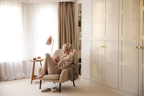
2026 is the year that we're creating calm, soothing spaces.

Getting into a good sleep routine can take time.
Whether you have an exact vision in tow, or are just at the beginning stage of your home renovation, we have heaps of inspiration for you to get stuck into.
Find a wealth of design tips, trends and inspiration in the pages of our brochure, magazine and on our blog. Our experts are always ready to help you create dream home, pop in store or book your free design visit for experts to help on bringing your vision to life.