
|
How to add colour to a period property
A period property comes with plenty of character and unique features, but did you know that it can also be the perfect canvas for more than a splash of colour?
At the heart of colour creation and innovation for the industry of interiors and decor, you’ll find Farrow & Ball. Creating exceptionally high quality paints in a collection of carefully crafted colours.
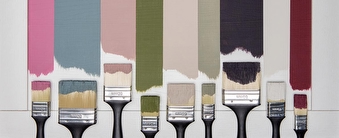
Their latest announcement of nine new colours has captivated décor enthusiasts including ourselves. We explore these beautiful new tones further...
A red based black, Paean black is Georgian inspired colour conjuring up images of old leather hymnals. A deep and dark tone, we believe this will be beautifully paired on internal metalwork. The romantic, muted rose of sulking room pink is designed for that light, feminine bedroom tone, aptly named after the French ‘bouder’ – to sulk. We believe this would pair beautifully in a room with Hammonds White Ash finished fitted furniture.
Rangwali is a bright and exotic pink that creates beautiful and dramatic shades by absorbing the depth of colour with a variance of light. A rich deep red with an edge of purple, this baroque colour, Preference Red, is named in honour of the original name of the F&B Company, Preference Paints.
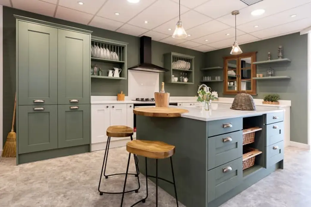
A mid-century modern green named after Japanese tea leaves, Bancha is a strong colour perfect for kitchens. A down to earth blue hue, De Nimes, named from the everyday workwear made in the French city Nimes.
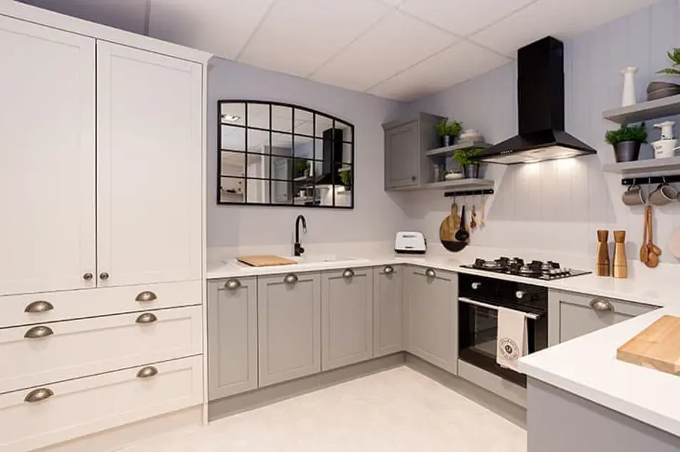
Leading onto the more neutrals of the group, School House White is a soft, light shade named after the shaded white from school walls. Treron is a grey green version of Farrow & Ball classic Pigeon. With a traditional, modern feel we feel this pairs beautifully with shaker style kitchen cabinetry. A relaxed, earthy tone, Jitney reminds us of sandy beaches and Oxford Stone and is beautiful when paired with warm woods and brown based tones.
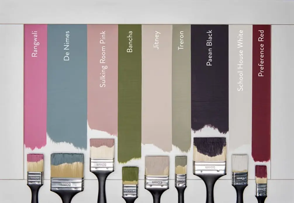
Each tone brings something unique accompanying the furniture, while the bolder tones of Paean Black and Preference Red will create depth and shadows in eye-catching tones, Old School House White and Jitney will be bright and reflect the light while paired beautifully with grey worktops. Treron and De Nime match closely with our current palette tones like Sea Salt and Boat House Blue, creating a relaxed and modern painted finish paired with the classic shaker style cabinetry.
A period property comes with plenty of character and unique features, but did you know that it can also be the perfect canvas for more than a splash of colour?
Designed to match a room's layout, fitted furniture can be a real interior design saviour, particularly if you have a home with unusually shaped bedrooms, offices, living rooms and so on.
Although a large bedroom opens endless design possibilities, decorating it can feel overwhelming. It involves choosing furniture that optimises the space without looking out of place.
Whether you have an exact vision in tow, or are just at the beginning stage of your home renovation, we have heaps of inspiration for you to get stuck into.
Find a wealth of design tips, trends and inspiration in the pages of our brochure, magazine and on our blog. Our experts are always ready to help you create dream home, pop in store or book your free design visit for experts to help on bringing your vision to life.