| Bedroom
How to achieve an under-the-sea kids' bedroom
Set a course for under the sea! With this guide from Hammonds, creating this uplifting and restful kids' bedroom theme will be smooth sailing.
“A blue-based purple that takes our awareness and potential to a higher level. Ultra-violet lights the way to what is yet to come.” – Leatrice Eiseman, Executive Director
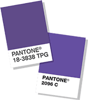 It’s an exciting time as Pantone has just released their colour of the year for 2018. Their choice is ultra violet, a luxurious and decadent colour stepping out of the path of the current trends; this exciting and bold colour makes a real statement. Pantone Vice President Laurie Pressman has said the colour was chosen to “evoke a counterculture flair”.
With so much importance behind the colour of the room that you build to create your home, leaders like Pantone guide the way. Inspired by this lead we build on from these colours to become influencers within our own industry of fitted furniture and home decor.
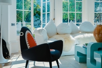
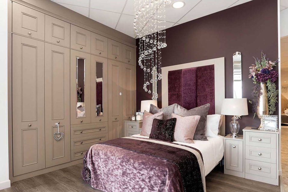
We love pairing this colour of this year deep purple with our Harpsden in rich praline, exuding luxury with a beautiful beading and shaker style effect. Sumptuous textures in this rich purple bring this range to life, like our plush handmade headboards in Hammonds fabric ‘Damson’.
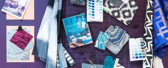
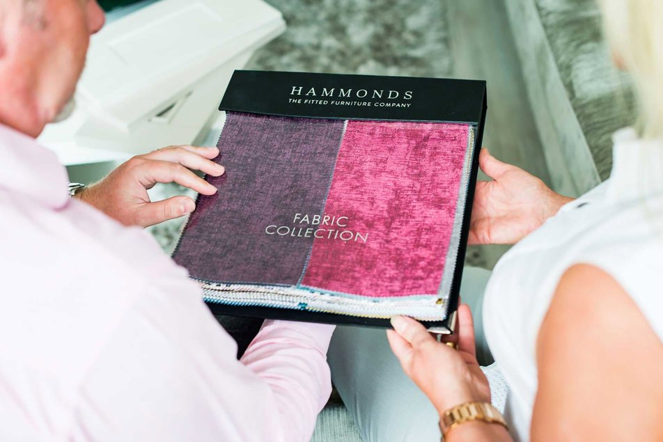
Discover exciting inspiration on every page in our brand new brochure including expertly styled fitted furniture display with trend leading colours and beautifully finished customers real rooms.
Set a course for under the sea! With this guide from Hammonds, creating this uplifting and restful kids' bedroom theme will be smooth sailing.

Enjoying the colour-drenching trend? Take it one step further with pattern drenching, the latest look in maximalist interiors that’s on everyone’s lips.

Discover four ways to transform your wasted box room into a functional space that enhances your daily life at home.
Whether you have an exact vision in tow, or are just at the beginning stage of your home renovation, we have heaps of inspiration for you to get stuck into.
Find a wealth of design tips, trends and inspiration in the pages of our brochure, magazine and on our blog. Our experts are always ready to help you create dream home, pop in store or book your free design visit for experts to help on bringing your vision to life.