| Decluttering, Advice
The Invisible Workload at Home: Why Parents Feel Overwhelmed | Hammonds Furniture
Modern family life has never been busier, and for many parents, the home has become a constant source of responsibility.
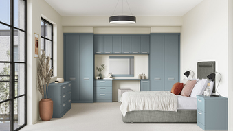
In interior design, colour isn't simply a decorative element; it's a powerful tool that can shape emotions, influence behaviours, and transform spaces. Yes, with just a simple colour change, you can change how you feel in your home! Whether you're aiming to create a cosy retreat or a vibrant gathering space, your colour choices should reflect the intended mood and function of the room.
For example, a bedroom designed for relaxation and restorative sleep might benefit from cool, soothing colours like soft blues and greens, while a lively family room could be infused with warm, inviting hues like golden yellows and earthy oranges.
From serene and dreamy blues to fiery passionate reds, each hue carries its own unique psychological associations.
While colour can have a profound effect on the mood and atmosphere of a space, it's essential to strike a balance between bold statements and subtle accents. Too much of a vibrant hue can overwhelm the senses, while an excess of neutrals can create a bland and uninspiring environment.
Consider using a combination of colours to create visual interest and depth within a room. Experiment with contrasting tones, textures, and patterns to add personality and dimension to your design scheme. And don't be afraid to incorporate pops of colour through accessories, artwork, and furnishings to inject personality and charm into your space. Head over to Instagram for this week’s Moments to catch our deep dive into colour psychology!
Modern family life has never been busier, and for many parents, the home has become a constant source of responsibility.
A luxurious bedroom doesn't have to be restricted to large spaces. It's all about using the space you have with intention.

A period property comes with plenty of character and unique features, but did you know that it can also be the perfect canvas for more than a splash of colour?
Whether you have an exact vision in tow, or are just at the beginning stage of your home renovation, we have heaps of inspiration for you to get stuck into.
Find a wealth of design tips, trends and inspiration in the pages of our brochure, magazine and on our blog. Our experts are always ready to help you create dream home, pop in store or book your free design visit for experts to help on bringing your vision to life.