| Bedroom, Inspiration, Small Home
Luxury bedroom design ideas for small spaces
A luxurious bedroom doesn't have to be restricted to large spaces. It's all about using the space you have with intention.
If two May bank holidays weren’t enough to keep us feeling rosy, we’re also stepping into our designers’ shoes this week to try our hand at interior styling with a design challenge.
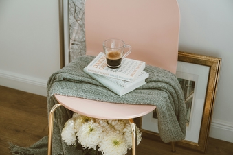
The task? Creating a cosy home with a monochrome colour scheme, using just two shades of pink as a base.
Monochrome palettes stick to one primary colour, with varying shades and tones used throughout to create depth and details. Colour drenched rooms are the most extreme example of a monochrome palette, and these unabashedly bold spaces are the perfect way to take a pop of colour to the next level.
But narrowing down a rainbow spectrum of colours to just one can feel like an impossible task. Is yellow too vibrant? Is blue too overwhelming? Does green just feel too outdoorsy if it’s used on every surface? Taking a step back and simply selecting a colour that you love can be helpful in just getting stuck in. And if you’re really unsure… start with pink!
Pink doesn’t always need to be pastel-hued or reserved for Barbie. In fact, pink works as a neutral base for most colour palettes or aesthetics due to the huge variation in undertones—warm shades create a soft and dreamlike feel when accompanying reds and yellows, whereas blue-toned pinks offer cool contrast against rugged natural textures or darker colours. Pink also offers an incredible variation in shades, tints, and tones, which is perfect when you’re limiting yourself to one colour. From a delicate blush, all through to crimson neons so bright you’ll need sunglasses to look at, pink really does have it all.
Our favourite tip for creating a monochrome space is to experiment with texture and light vs dark. Shiny accessories or tactile details keep a room from looking too similar, preventing the space from falling flat or beginning to lack soul. Try a glass vase against a paperweight made from uncoated plaster, for example. The smoothness from the glass juxtaposes the rough plaster, for a small element of playfulness. Light vs dark can be used in multiple ways: either varying where you place your light fixtures, or by opting for drastically darker furniture as accent pieces. This is perfect if you have an area of the room you’d like to draw attention to (a gorgeous bay window perhaps!), or a space you’d like to focus on less (perhaps children’s toys stashed in a corner).
We took to Instagram this week to take on the monochrome pink challenge. Let us know how you think we did… how would you style a pink/pink colour palette?
A luxurious bedroom doesn't have to be restricted to large spaces. It's all about using the space you have with intention.
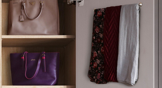
Victorian homes in the UK have stood the test of time.

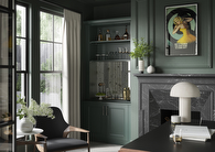
A period property comes with plenty of character and unique features, but did you know that it can also be the perfect canvas for more than a splash of colour?
Whether you have an exact vision in tow, or are just at the beginning stage of your home renovation, we have heaps of inspiration for you to get stuck into.
Find a wealth of design tips, trends and inspiration in the pages of our brochure, magazine and on our blog. Our experts are always ready to help you create dream home, pop in store or book your free design visit for experts to help on bringing your vision to life.