
| Decluttering, Relax
The art of slow living: Designing a home that encourages you to unplug and unwind
The slow living trend offers something radically different in a world that prioritises speed, productivity and constant connection.


Our homes are the backdrops to our emotional lives, where colour acts as a powerful communicator. The hues you choose for walls and furniture can trigger specific neurological responses by stimulating your mind or gently coaxing it into a state of repose.
As the boundary between the external world and your internal sanctuary blurs, selecting the right palette is essential. By understanding how calming colours for bedroom design work, you can intentionally prepare your body for sleep and create a retreat that actively reduces the anxieties of your day.
Interior design is as much an exercise in psychology as it is in aesthetics. Every shade carries a distinct emotional weight. While vibrant reds and yellows foster energy in social spaces, they are often too stimulating for a room dedicated to rest.
Conversely, restful environments flourish with soft, muted tones that encourage tranquillity. Colours like blue and green are psychologically linked to stability by evoking the stillness of a forest or the vastness of the ocean.
Opting for a palette that avoids high-contrast intensities provides your senses with the calmness you need to decompress.
Creating a serene environment requires a considered selection of harmonious hues. While personal preference plays a role, certain calm bedroom colours are universally recognised for their restorative properties.
There's a profound subconscious association between soft blues and greens and the natural world. Incorporating these calming tones and colours for your bedroom walls and furnishings helps your mind relax by reducing perceived stress.
Whether you opt for a misty seafoam or a delicate powder blue, these colours promote deeper sleep by creating a peaceful, airy atmosphere that feels inherently stable.
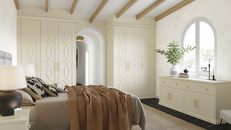
If blue feels too cool for your aesthetic, warm neutrals offer a sophisticated alternative.
Beige, ivory and warming, earthy tones create a cocoon-like environment that feels protective. Unlike the clinical feel of a stark white, these warmer iterations provide a soft, non-distracting canvas that allows your mind to wander and eventually rest. These are the ideal calm bedroom colours for those who find a busy palette mentally taxing before bed.
If you're seeking a touch of warmth and elegance, pale pinks and lavenders are excellent choices.
Lilac and soft mauve, in particular, have been linked to improved sleep quality due to their gentle, restorative effect on the psyche. When used in a bedroom, they create a sophisticated backdrop that can feel blissfully romantic and profoundly peaceful.
A successful calming bedroom colour schemes strategy doesn't require a purely monochromatic approach. Instead, it relies on the careful balancing of a base palette with harmonising accents. The goal is to add depth without introducing busy visual noise.
If your foundation consists of soft blue, consider layering the space with pale blush pillows or dove grey linens. For a neutral-toned room, introducing light wood accents, such as an oak bedframe or walnut bedside tables, adds an organic warmth that anchors your space.
These subtle shifts in tone and material provide a sensory richness that feels grounded and exclusive, ensuring the room remains inviting and thoughtfully curated.
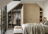
In smaller homes, the choice of palette is critical.
Light, airy colours possess a unique ability to reflect light, making a small bedroom feel significantly more spacious. A cramped environment can feel enclosed, but pale tones create a perception of openness and calm.
Natural light should be a primary consideration, as light-coloured walls and furnishings amplify daylight to create a tranquil, uplifting atmosphere. To maintain this sense of order, storage must be integrated seamlessly.
For those looking to maximise a smaller footprint, beige fitted wardrobes are an exceptional choice. The soft, neutral finish blends into your furniture, providing ample storage while maintaining a restful visual flow. By housing belongings behind bespoke doors, you remove the visual chaos that often hinders bedroom relaxation.
The journey toward a better night's sleep begins with an environment that respects your need for peace. Understanding the intersection of colour psychology and clever design allows you to transform your bedroom into a sanctuary. Here, you can nurture your wellbeing and prepare yourself for tomorrow's challenges.
At Hammonds, we believe that relaxation is only possible when your home is in harmony. If you're ready to explore how a bespoke layout and a curated palette can redefine your rest, we're here to help. Book a free design visit with one of our experts today to create a space that's as organised as it is beautiful, tailored specifically to the way you live.
The slow living trend offers something radically different in a world that prioritises speed, productivity and constant connection.
We’ve all been there, staring into the wardrobe, just waiting for something perfect for the occasion to jump out at us.
Dearest gentle reader… so, you've found yourself inspired by the decadent world of Bridgerton, and now you want to incorporate early 19th-century chic into your home design?
Whether you have an exact vision in tow, or are just at the beginning stage of your home renovation, we have heaps of inspiration for you to get stuck into.
Find a wealth of design tips, trends and inspiration in the pages of our brochure, magazine and on our blog. Our experts are always ready to help you create dream home, pop in store or book your free design visit for experts to help on bringing your vision to life.